

By Charles Solomon
The amazing artwork of Sleeping Beauty has now become iconic for its unique detail and shape, but how did the stunning designs of this animated classic come to be?
The day Walt Disney put the first scenes from Sleeping Beauty into production, he told sequence director Eric Larson, “What we want out of this is a moving illustration. I don’t care how long it takes.” He actually meant something more specific: A moving illustration designed by painter Eyvind Earle. In one meeting, he said, “For years and years I have been hiring artists like Mary Blair to design the styling of a feature, and by the time the picture is finished, there is hardly a trace of the original styling left. This time Eyvind Earle is styling Sleeping Beauty, and that’s the way it’s going to be!”
Once Upon A Dream Come True
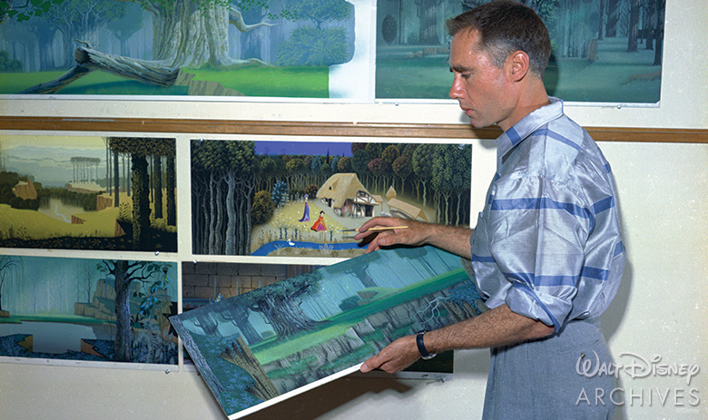
For Earle, receiving such an important assignment from Walt fulfilled a lifelong dream. In 1934, when he was 18, he applied for a job at the old Disney Studio on Hyperion Avenue and was rejected. He applied again the next week and was rejected again—a process that continued nonstop for three years. After serving in the military, attending classes, painting portraits, and designing Christmas cards, he applied yet again in 1951—and was hired as a background painter.
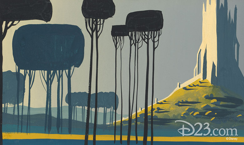
Visits to Continental museums exposed Earle to pre-Renaissance Northern European art that would influence his personal style: the artists Dürer, Van Eyck, Breughel, as well as Gothic art, medieval tapestries, and illuminated manuscripts. These artists didn’t follow the rules of perspective developed by the Italian Renaissance painters: They saw the world differently and depicted it differently.
An Illuminated Inspiration
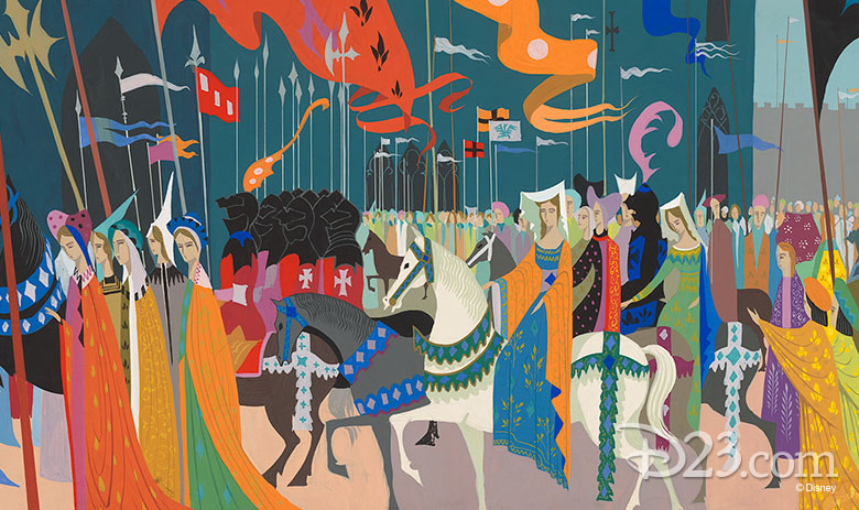
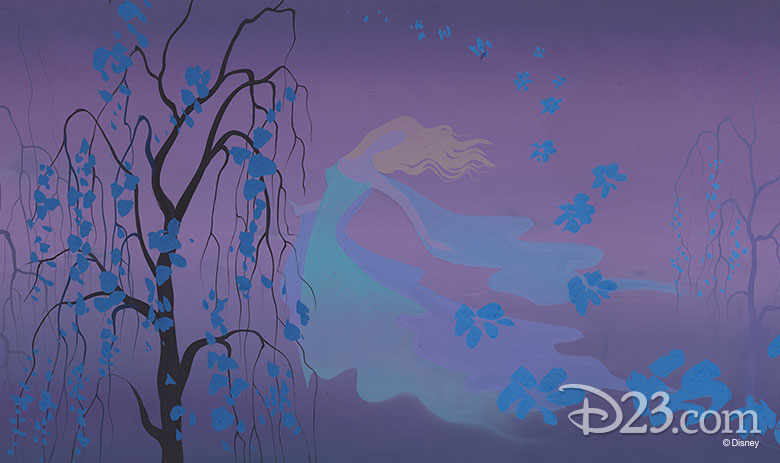
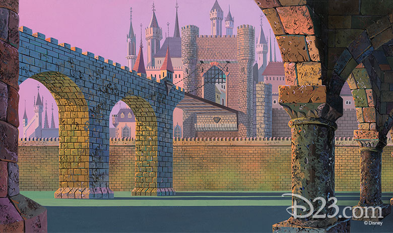
A key influence on Earle and Sleeping Beauty was the illuminated manuscript the Très Riches Heures de Jean, Duc de Berri, an opulent Book of Hours (a devotional volume that included Psalms, prayers, and a calendar of Church feasts) begun by Herman and Jean Limbourg around 1413. From it, Earle took the key colors for the film: The lapis lazuli blue of the knight’s banners, the yellow-green of Maleficent’s flames, the shell pink and paler blue of Aurora’s gown.
Earle paired these historic influences with a second artistic vision: The modern painting of the early 20th century as interpreted by the artists of the innovative UPA animation studio. The UPA designers and animators looked to Matisse, Cezanne, Klee, Modigliani, and Picasso. The characters and backgrounds in their films were flat, boldly colored and stylized. The innovative look of their cartoons won praise from highbrow art critics who had rarely acknowledged the existence of animation—and pleased audiences around the world.
The Struggle of Stylization
Earle’s fusion of medieval and modern bore little resemblance to the European storybook look of Snow White and Pinocchio—and not everyone at the Studio embraced Earle’s vision. Some of the artists complained the designs were too busy.
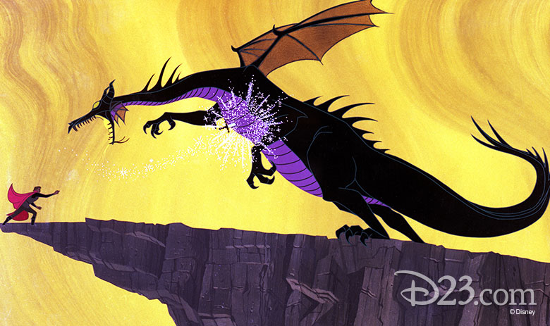
The Studio’s top draftsmen, Marc Davis (who animated Princess Aurora and Maleficent) and Milt Kahl (who drew Prince Philip), seem to have enjoyed the challenge. Decades later, animators regard their work with awe: Glen Keane studied how Davis handled the art nouveau curls of Aurora’s hair when he began work on the title character in Pocahontas.
Ron Dias, who worked as a clean-up artist on Aurora and Maleficent, felt Earle was misunderstood by his co-workers. “I got to know and love Eyvind Earle because he spent so much time with me, he was wonderful to me. He was a mentor,” Dias says. “I used to go up to his office and look at what he was doing. He used to let me stand next to him and watch him paint. We would chat and became close friends.”
Hail to the Princess Aurora
60 years after its premiere, Sleeping Beauty stands as a landmark in animation history for its singular designs and animation. The new generation of artists working at Disney, Pixar, and other studios cite Sleeping Beauty as an influence and an inspiration. Oscar®-winning Pixar director Pete Docter says, “Eyvind Earle made great choices in the backgrounds. Most of the photos I took of the South American jungle for Up are just a mess. You can’t really tell what’s foreground and what’s background. Something we referenced from Earle’s work is how light defines where detail is. Where a streak of light crosses a tree, you’ll suddenly see this ornate bark; further up, where the trunk is in shadow, there’s less detail.”
Mike Giaimo, the art director of Disney’s Frozen, explains, “I cut my artistic teeth on Eyvind Earle, Sleeping Beauty, 101 Dalmatians, Walt Peregoy, and Mary Blair, and the kind of color relationships they used. I call the palette in Frozen ‘jewel-like,’ and there is certainly an Earle connection: The colors are deep, rich, analogous. They don’t stray far away from each other; it’s their relationship and how they vibrate. I like hints of vibration that titillate the eye.”
Disney’s retelling of the classic Sleeping Beauty fairy tale is now beloved by fans around the world. Chicago Reader critic Dave Kehr praised it as “the masterpiece of the Disney Studios’ postwar style.”
This article originally appeared in a slightly different form in the Summer 2014 edition of Disney twenty-three and was modified for D23.com.