By Michael Crawford
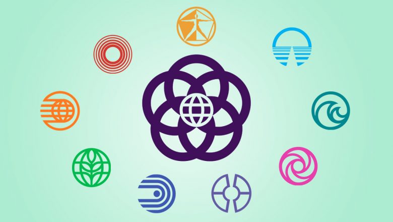
When designing Epcot Center, the talented minds at WED Enterprises–now known as Walt Disney Imagineering–made sure that every visual element made guests feel as if they were truly stepping into a community of tomorrow. Take, for example, the contemporary circular symbols designed for Epcot: Spaceship Earth, Universe of Energy, Horizons, World of Motion, Communicore, Journey Into Imagination, The Land, The Living Seas, and Epcot itself. Here how’s some of these beloved icons came to life.
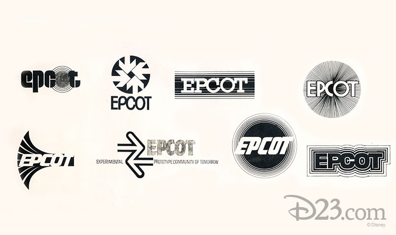
Epcot needed an appropriately futuristic logo. During the 1970s, Disney designers came up with a variety of potential logos, some of which are seen here.
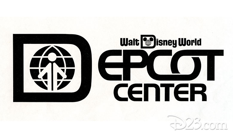
This logo was proposed in 1978. Card Walker, then Chief Executive Officer of The Walt Disney Company, nixed the design, saying that it reminded him of a stop sign.
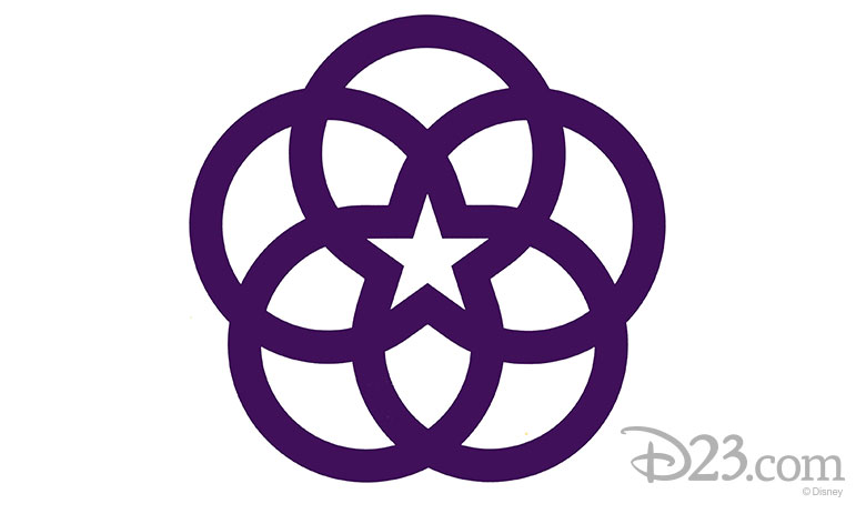
It was designer Norm Inouye who would eventually hit upon the idea: five rings–representing information, technology, environment, education, and entertainment–surrounding a central star.
When those individual concepts linked up, he says, the logo for Epcot Center was created. “All the other [pavilion logos] are single rings, and the Epcot logo was five rings and represented what I thought was the idea of Epcot Center.”
Disney Legends Marty Sklar and John Hench, who oversaw the Epcot design efforts, liked the idea. After some modifications, Norm’s design became the familiar “flower” logo which would become a welcome sight to Epcot visitors for years to come.
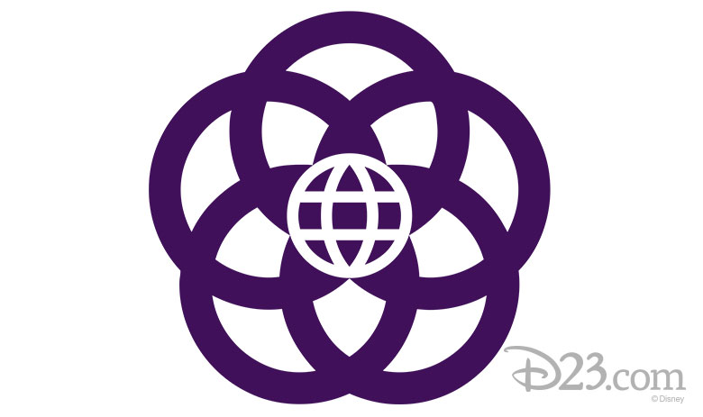
Marty summarized the symbolism behind this iconic image:
“The Epcot Center logo symbolizes unity, fellowship, and harmony around the world. Five outer rings are linked to form the shape of a flower–a celebration of life. The heart of the logo is the Earth, embraced by a star symbolizing hope–the hope that with imagination, commitment, and dedication, we can create a better tomorrow.”
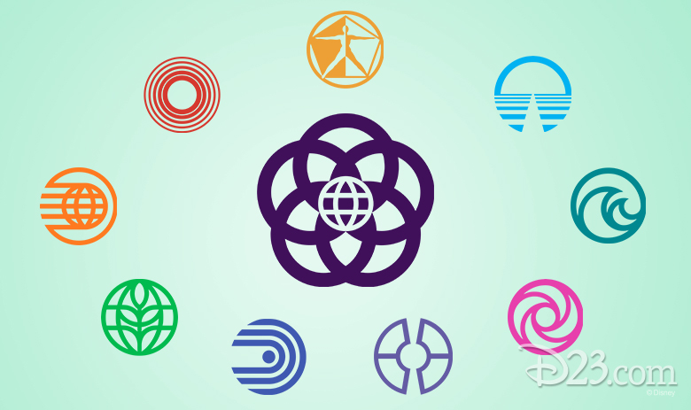
Among the familiar sights at Epcot were the symbols used to represent individual pavilions. Inouye designed these, as well (except for the Wonders of Life pavilion, which was added later). But arriving at these unforgettable icons didn’t come easy. “We did hundreds!” Norm says. “When we were presenting to Marty and John, I would cover the walls [with logos] and it was almost too much for them.”
“I did a whole series of different directions just to get a sense for where they were at,” he adds. “So when I learned they wanted a more contemporary design, we boiled things down. And consequently, that’s what we ended up with—something contemporary.”
Whatever the inspiration, Epcot’s graphical style remains just as sleek and futuristic today as it did back in 1982.


