By Pete Vilmur
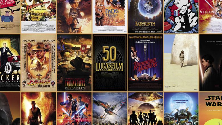
The 34 posters depicted in Lucasfilm’s 50th anniversary commemorative print, which is included with the Summer issue of Disney twenty-three, was a delightful exercise for the Lucasfilm team, as it allowed us to capture all the excitement, romance, adventure, and hope of the multiple Lucasfilm productions in a single image. It also provided an opportunity to share some lesser-known poster artwork from around the world, which can be dramatically different from the more recognized and broadly circulated versions used in the U.S.
The process of selecting the poster images first required taking inventory of the scores of designs that have been produced for Lucasfilm productions over the past 50 years. This number was quickly pared down to 97 finalists after removing much of the repeated imagery used on posters throughout the ’90s and early 2000s, when nearly all global markets used similar poster designs. Those 97 were then put before Lucasfilm team members to select images that both conveyed the broad scope of Lucasfilm storytelling while revealing the vast array of international poster artwork.
While we can’t discuss all the posters in detail if we want to keep this at a readable length, we did want to point out some unique selects:
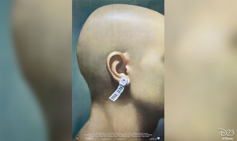
THX 1138 – While THX is not technically a Lucasfilm production (it was produced by American Zoetrope), it was George Lucas’ first feature film, and informed much of his subsequent work. The poster we chose comes from the 2004 re-release, which is a spare but powerful photo-realistic illustration of THX 1138.
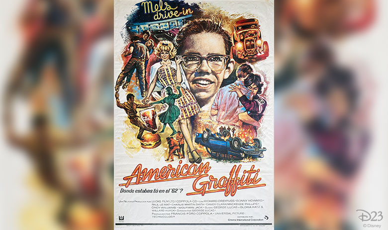
American Graffiti – This poster art is unique to Spain, who opted for a more traditional illustrative style compared to the U.S. version, which was done by famed MAD Magazine artist Mort Drucker. Ironically, the unknown artist for this Spanish version scribed a signature which seems to read “mad” – initials, perhaps?
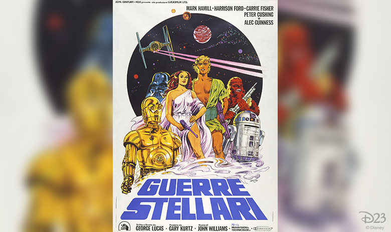
Star Wars: A New Hope – Michelangelo Papuzza is responsible for much of the campaign artwork used in Italy for the first release of Star Wars: A New Hope in 1977. Bright colors and a light, comic illustrative style seem to distinguish this poster from others created for the first film, and we couldn’t resist its unabashed, nonconventional approach to advertising the film that launched the Star Wars saga.
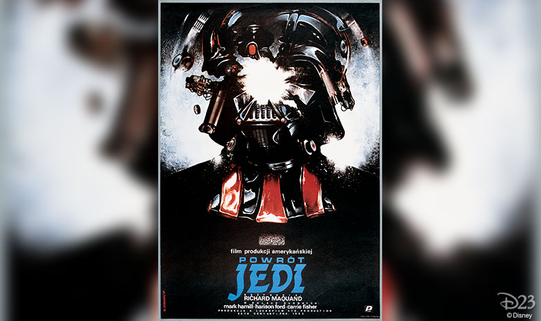
Star Wars: Return of the Jedi – The exploding Darth Vader helmet illustration by Witold Dybowski was exclusive to Poland, and upon closer inspection features various camera parts inserted as components of Vader’s mask. This poster always seems to inspire a sense of whimsy and wonder, two essential ingredients of Lucasfilm productions.
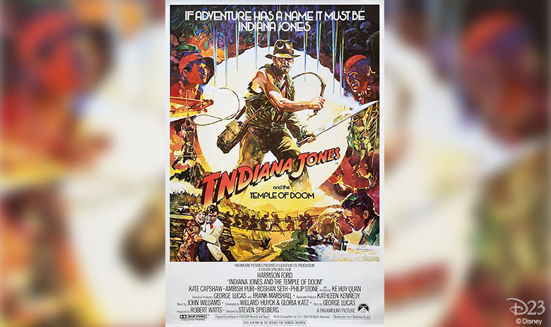
Indiana Jones and the Temple of Doom – This period-style illustration by Mike Vaughan was not broadly used in 1984, except in Australia, New Zealand, and to a lesser extent, the United Kingdom, which is where this poster is from. Interestingly, this vertical one-sheet format was the only one to use this design in the U.K., as the more common horizontal “quad” posters featured the now-familiar U.S. “standing Indy” artwork by Bruce Wolfe.
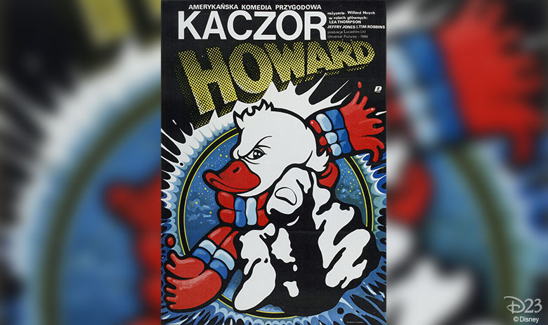
Howard the Duck – While Lucasfilm’s 1986 Howard the Duck production may have its quirks, this 1987 Polish poster by Jakub Erol (who previously turned in a starkly beautiful portrait of C-3PO for the Polish release of Star Wars: A New Hope in 1979) definitely gets ones attention. He certainly got ours!
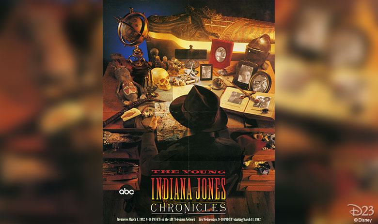
The Young Indiana Jones Chronicles – For Young Indy, we didn’t have a traditional one-sheet for the series, but found this wonderful promotional poster hanging in the office of Lucasfilm PR writer and Young Indy enthusiast, Lucas Seastrom. “It’s full of wondrous detail that imbues both the whimsical romance and the curious mind of Indiana Jones,” says Seastrom. “By not revealing Indy’s face, it teases both a new take on the character and the promise of stepping into his shoes.” So yeah, this made our cut.
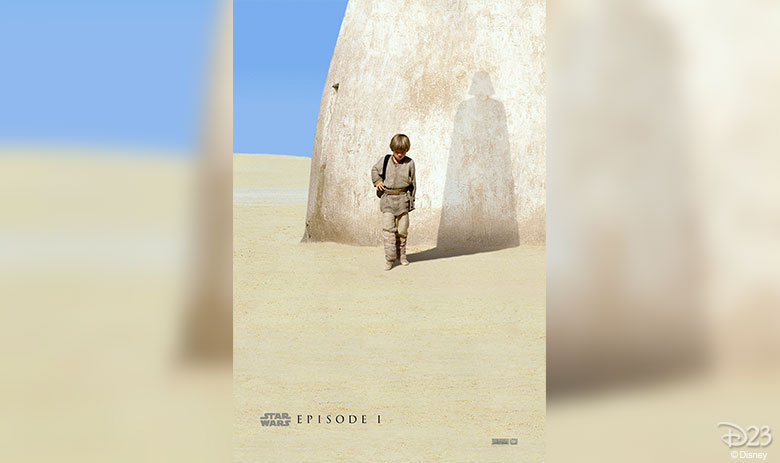
Star Wars: The Phantom Menace – While the image of young Anakin Skywalker casting a shadow of the Sith Lord he would become is not as unfamiliar or exotic as some of the posters we’re highlighting here, it is a perpetual favorite among fans for its mythological resonance and elegant simplicity. Design is by Ellen Lee.
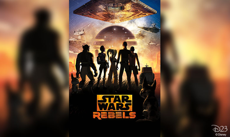
Star Wars Rebels – This poster, which was printed for employees of Lucasfilm Animation, wonderfully captures the bittersweet spirit of the series conclusion, and was designed by series executive producer Dave Filoni.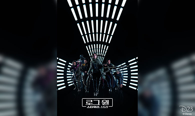
Rogue One: A Star Wars Story – The Star Wars stand-alone movies seem to have welcomed back a tradition of varying poster designs around the world, including this unique poster exclusive to South Korea. The graphic shot of the Rebel heroes within the ‘tunnel of light’ makes for a stunning composition that prompts a second glance, which was likely by design.
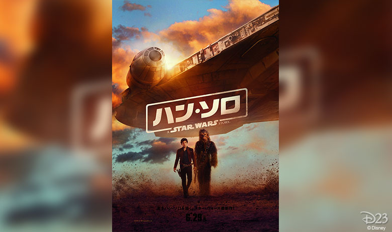
Solo: A Star Wars Story – Like Rogue, there were multiple designs for Solo used throughout the world, this one from Japan. While many of the posters depicted the full cast, this one distilled the messaging down to the friendship between Han, Chewie… and, of course, the Falcon.
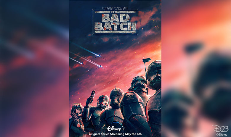
Star Wars: The Bad Batch – Truth be told, we tried to get the final launch artwork to include on this commemorative poster, but it wasn’t ready in time for print. We think this teaser is just as much a stunner, though.
Of course, we just provided the poster images—it was the Disney twenty-three design team who heroically removed old fold lines and wrinkles in many of the posters, and then pulled it all together into the fantastic finished design for the poster. It came out better than we could have imagined, and we are so thankful for the opportunity to celebrate Lucasfilm’s 50th anniversary with Disney twenty-three readers in this way.


